


Get In Touch
First Lane Marg, Kumaripati-5,
Lalitpur Metropolitan City, Nepal- Email: nepal@globdig.com
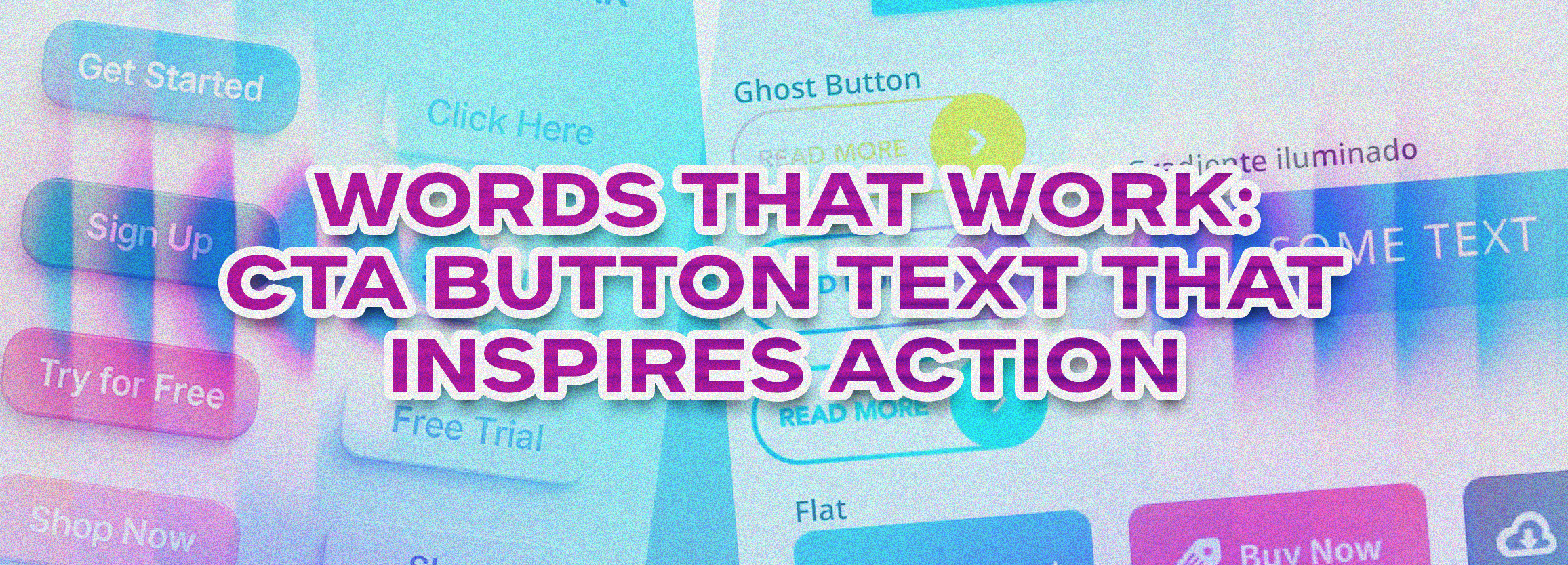
Words That Work: CTA Button Text That Inspires Action
May 2, 2026
As a small business owner, startup founder, or SaaS marketer, you know that every click counts. Your CTA button text—the words that appear on buttons like “Buy Now,” “Get Started,” or “Learn More”—can make or break your conversion rates. Even the most beautifully designed website won’t generate leads if your buttons fail to motivate action.
In this guide, we’ll explore how to craft CTA buttons that drive user engagement, improve click-through rates, and boost your business growth. You’ll also get actionable frameworks and real-world examples to implement immediately.
Why CTA Button Text Matters
Your CTA buttons are the gateways to conversion. They guide users toward taking action—whether it’s signing up for a newsletter, booking a consultation, or making a purchase.
- First impressions count: A poorly worded button can confuse users or fail to convey value.
- Conversions depend on clarity: Clear, concise, and persuasive button text leads to more clicks.
- Psychology drives action: Action verbs and emotionally compelling words trigger motivation and urgency.
Example: A study by HubSpot found that changing a CTA from “Submit” to “Get Your Free Guide” increased conversions by 38%. That’s the power of words that work.
Top Principles for Writing Effective CTA Button Text
1. Use Action-Oriented Verbs
Start your button text with strong verbs like:
- Get
- Download
- Discover
- Claim
- Start
Example:
- ❌ “Submit”
- ✅ “Get Your Free SEO Audit”
Action verbs make the desired action clear and create urgency.
2. Communicate Value
Users want to know what’s in it for them. Include benefits or outcomes:
- “Boost Your Website Traffic”
- “Save 30% on Your First Order”
- “Access Exclusive Tips Today”
Highlighting value turns passive readers into active leads.
3. Keep It Short and Clear
Buttons should be scannable. Limit your button copy to 2–5 words whenever possible.
- ✅ Clear: “Book a Free Consultation”
- ❌ Confusing: “Click Here to Start Your Digital Marketing Journey With Us”
4. Create Urgency or Scarcity
Urgency encourages immediate action:
- “Claim Your Spot”
- “Limited Time Offer”
- “Get Started Today”
5. Personalize When Possible
Tailoring CTA buttons to your audience increases engagement:
- “Get My Free Audit” (vs. generic “Get Free Audit”)
- “Start Your Growth Plan” for SaaS users
Common Mistakes to Avoid in CTA Button Text
- Vague or generic text – “Click Here” or “Submit”
- Overcomplicated copy – Too many words confuse users
- Lack of context – Users must know what happens next
- Ignoring mobile users – Buttons must be concise and thumb-friendly
Mini Case Study: A SaaS startup saw a 25% increase in demo requests by changing the CTA from “Learn More” to “Start My Free Trial Today.”
Step-by-Step Framework to Create High-Converting CTA Buttons
Step 1 – Define the Goal
- Lead capture?
- Product purchase?
- Service inquiry?
Step 2 – Identify the Benefit
Ask: What does the user get? How will it solve their problem?
Step 3 – Select an Action Verb
Pick from high-converting verbs like: “Get,” “Start,” “Claim,” “Discover.”
Step 4 – Add Urgency or Personalization
Combine urgency, benefit, and personalization:
- ✅ “Claim Your Free Marketing Audit Today”
- ❌ “Submit Form”
Step 5 – Test and Optimize
Use A/B testing to compare different CTA buttons. Tools like Hotjar, Google Optimize, or Optimizely can provide insights.
Real-World Examples of Effective CTA Button Text
| Business Type | Original CTA | Optimized CTA | Result |
|---|---|---|---|
| SaaS | Sign Up | Start My Free Trial | +30% conversions |
| E-commerce | Buy | Claim Your 20% Discount | +22% CTR |
| Local Service | Contact Us | Book Your Free Consultation | +25% leads |
Integrating CTA Buttons Into Your Website UX
- Place above the fold on landing pages
- Use contrasting colors for visibility
- Pair with supporting copy that reinforces value
- Include multiple touchpoints (header, mid-content, footer)
Example: On a SaaS landing page, the header CTA might say “Start My Free Trial,” while a mid-page button could reinforce with “Get Your Free Audit Now.”
Measuring the Success of Your CTA Buttons
- Click-through rate (CTR) – percentage of users clicking the button
- Conversion rate – percentage completing the desired action
- Heatmaps – identify where users focus attention
- A/B testing results – refine wording and placement
Pro Tip: Small changes in button text can produce 20–40% lift in conversions without redesigning your entire page.
FAQs About CTA Button Text
What is CTA button text?
CTA button text refers to the words on a clickable button that prompts users to take action, such as “Get Started” or “Book a Free Consultation.”
How do I make my CTA buttons more effective?
Use action verbs, communicate benefits, create urgency, and keep your text concise. Test different versions to see which converts best.
How long should CTA button text be?
Ideally 2–5 words for clarity and scannability. Avoid overloading users with information on the button itself.
Can I personalize CTA button text?
Yes! Personalization increases engagement. Examples include “Start My Free Trial” instead of generic “Start Trial.”
How do CTA buttons impact lead generation?
Effective CTA buttons guide users toward actions like service inquiries, consultation requests, or demo sign-ups, increasing lead capture.
Learn how we can help your business optimize CTA buttons for higher conversions.
Boost Your Business With Strategic CTA Button Copy
Your CTA buttons are more than just clickable text—they’re critical drivers of user engagement, lead generation, and conversions. By applying action-oriented, benefit-driven, and urgency-focused copy, you can significantly improve your website’s performance.
At Global Digital, we specialize in creating conversion-optimized websites, compelling button copy, and marketing strategies that drive measurable results. Our team works with small businesses, startups, and SaaS companies to craft CTAs that inspire action and generate leads.
Ready to take your conversions to the next level? Book a meeting today!
Suggested Internal Links
External References