


Get In Touch
First Lane Marg, Kumaripati-5,
Lalitpur Metropolitan City, Nepal- Email: nepal@globdig.com
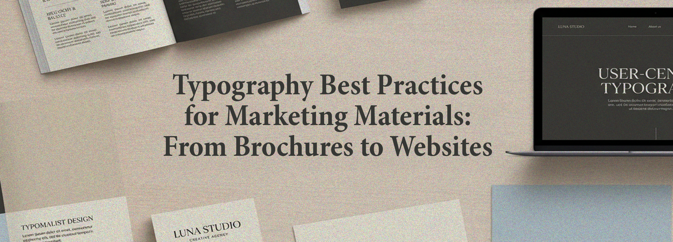
Typography Best Practices for Marketing Materials: From Brochures to Websites
December 18, 2025
Typography practices for marketing materials play a decisive role in how your audience perceives your brand. Whether it’s a brochure handed to a potential client or a website they browse at midnight, the way your text looks shapes their first impression. Clear, strategic, and well-designed typography strengthens your brand message and guides readers through your marketing materials effortlessly.
For many small business owners, marketers, entrepreneurs, and independent publishers, typography may seem like a small detail—but in reality, it’s one of the most powerful design elements. At Global Digital Nepal, we use strategic typography across print and digital projects to elevate communication, improve readability, and build brand authority.
In this guide, we break down proven typography practices for marketing materials, including brochures, websites, ads, landing pages, and social media graphics.
Why Typography Matters in Modern Marketing
Typography goes far beyond choosing beautiful fonts. It affects how your audience reads, understands, and remembers your message.
Typography Builds Brand Identity
When used consistently, typography helps establish a recognizable brand personality. For example:
- Serif fonts reflect trust and tradition
- Sans-serif fonts feel modern and minimal
- Script fonts add creativity and elegance
The right combination shapes how your brand is perceived across print materials and websites.
Typography Guides the Reader
Good typography creates a visual path, helping readers move naturally from the headline to the body copy, call-to-action, or offer.
Typography Enhances User Experience
Legible, well-spaced typography improves reading comfort and lowers friction—crucial for both marketing materials and web design.
For more on UX and website development, explore our services: Global Digital Services.
Best Typography Practices for Marketing Materials
1. Choose Fonts That Reflect Your Brand Identity
Font choice is the foundation of marketing typography. Your fonts must:
- Represent your brand’s personality
- Enhance readability across print and digital platforms
- Stay consistent across brochures, websites, and promotional graphics
For example, a modern tech business may choose clean sans-serif fonts, while a traditional brand may prefer serif fonts that convey trust.
Tip: Avoid using more than two to three fonts across all materials.
2. Establish a Clear Typographic Hierarchy
Hierarchy determines the importance of text elements. It tells the reader:
- What to read first
- What to skim
- What action to take
Your hierarchy might include:
- Headline: Bold, large, high contrast
- Subheadings: Medium weight, supportive
- Body text: Easy to read, well-spaced
- CTA (Call to Action): High visibility, actionable
This ensures your brochures, web pages, and marketing assets remain reader-friendly and visually structured.
3. Maintain Consistent Font Pairing
Font pairing means selecting fonts that complement each other. For instance:
- A modern sans-serif for headlines + a readable serif for body
- A bold serif headline + a clean sans-serif body
Consistency across all marketing materials—from brochures to websites—reinforces brand recognition.
4. Prioritize Readability and Legibility
Even the best fonts fail if they’re hard to read. When designing marketing materials, consider:
- Font size: Minimum 10–12 pt for print; 16 px for websites
- Line spacing: 1.4 to 1.6 for comfortable reading
- Letter spacing: Ensure letters don’t feel crowded
- Contrast: High contrast improves readability
Poor readability damages brand trust and reduces conversions.
5. Use Color Theory to Support Typography
Color affects moods, emotions, and visibility. When selecting typography colors:
- Use brand colors consistently
- Ensure enough contrast between background and text
- Test visibility on both screens and print
For advanced color strategies, reference design theory and color resources as needed.
6. Master Layout Theory for Balanced Designs
Typography works best when paired with strong layout design. This includes:
- Proper margins
- Balanced whitespace
- Strategic alignment
- Grid systems
Whether it’s a brochure or website, thoughtful layouts improve clarity and visual flow. See examples in our portfolio: Global Digital Portfolio.
7. Optimize Typography for Print Materials
Brochure design, flyers, business cards, and posters require special attention.
Tips for Print Typography:
- Choose print-friendly fonts
- Avoid thin fonts (they may disappear in print)
- Use CMYK color mode for accurate output
- Test your design before final printing
Printed branding materials depend heavily on typography to deliver visual impact and professionalism.
8. Optimize Typography for Websites and Digital Media
Typography plays an even more important role online due to screens, resolutions, and user behavior.
Key practices include:
- Use web-safe fonts or Google Fonts
- Maintain high readability on mobile
- Ensure scalable typography (responsive sizing)
- Use spacing and contrast to break up long pages
Typography directly affects website conversions—an area where Global Digital Nepal’s web development services consistently deliver measurable results.
9. Apply Consistent Typography Across All Marketing Channels
From brochures to Instagram posts to landing pages, typography must stay consistent to build a strong brand identity. Use:
- A brand style guide
- A font usage guideline
- Template-based designs
Consistency increases brand recall and strengthens credibility.
10. Avoid Common Typography Mistakes
Mistakes can distort your message and harm your brand. The most common include:
- Using too many fonts
- Poor contrast
- Tight spacing
- Overusing decorative fonts
- Inconsistent alignment
By avoiding these, your marketing materials remain polished and professional.
Typography for Brochures and Print Materials
Print design relies on precise typography. Brochures especially must balance visuals and text elegantly.
Brochure Typography Tips
- Use short paragraphs
- Highlight key messages
- Emphasize CTAs
- Maintain strong hierarchy
- Choose readable fonts at small sizes
Printed materials often determine offline brand perception—so typography becomes even more crucial.
Typography for Websites and Digital Campaigns
Here’s how typography enhances online marketing:
1. Increases Time on Page
Clean text encourages readers to stay longer on the website.
2. Improves Conversion Rates
Clear typography guides visitors toward CTAs like “Book a Meeting,” “Contact Us,” or “Download a Brochure.”
3. Strengthens SEO
Readable text improves engagement metrics, which indirectly supports search ranking.
Benefits of Professional Typography for Businesses
1. Stronger Brand Presence
Consistent typography ensures your brand is recognizable across platforms.
2. More Effective Marketing Materials
From brochures to websites, typography ensures clarity and persuasion.
3. Increased Conversion and Sales
Typography influences how users read, interpret, and act on your message.
4. Enhanced Credibility and Trust
Professional design reflects professionalism in the business.
Key Takeaways: Typography Best Practices
- Use consistent, brand-aligned fonts
- Create a clear hierarchy in all materials
- Maintain strong readability with proper spacing
- Apply color theory to enhance visibility
- Use layout theory for balanced designs
- Optimize typography for both print and web
- Maintain consistency across all channels
- Avoid clutter, low contrast, and decorative font overload
Conclusion & Call-to-Action
Typography is more than design—it’s communication. When done right, it amplifies your message, strengthens your brand, and improves marketing performance across brochures, websites, and print materials. Whether you’re building a brand from scratch or refining your existing materials, typography deserves careful attention.
If you want your marketing visuals, brochures, and websites to look more professional, compelling, and conversion-friendly, Global Digital Nepal is here to help.
Contact us today to elevate your brand’s design and marketing impact.