


Get In Touch
First Lane Marg, Kumaripati-5,
Lalitpur Metropolitan City, Nepal- Email: nepal@globdig.com
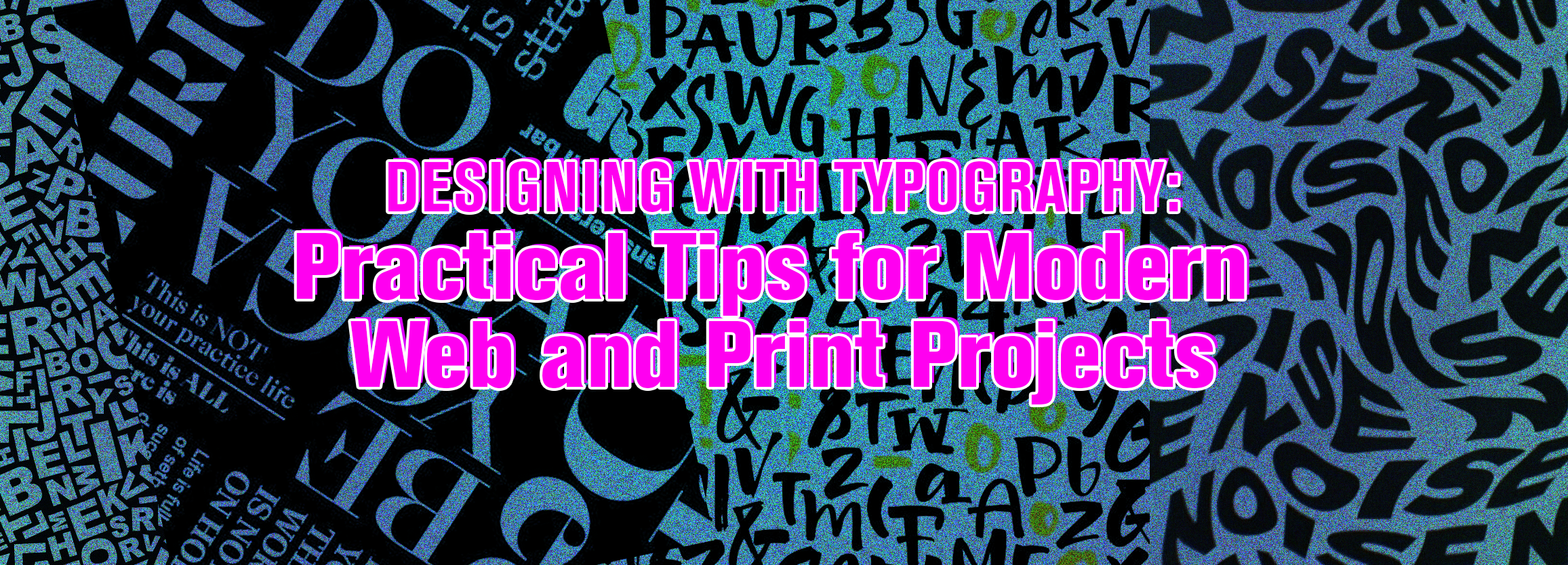
Designing with Typography:
Practical Tips for Modern Web and Print Projects
December 15, 2025
Introduction
design with typography is one of the most powerful tools in design. Whether you’re creating a website, building a brand, or producing marketing materials, how you choose and place type can shape perception, improve readability, and elevate your brand’s personality.
For clients working with Global Digital Nepal, strong typography doesn’t just make things look good — it directly impacts user engagement, trust, and conversion. This guide explains practical, actionable tips for modern web and print projects to help you get measurable results.
Why Typography Matters in Modern Web and Print Design
Typography is the bridge between message and audience. It determines whether your content feels premium or casual, trustworthy or playful, modern or outdated.
- Improves readability across devices and print
- Creates a consistent brand identity
- Guides readers and boosts conversions
- Enhances perceived professionalism
At Global Digital Nepal, we use typography as a core element of both web design and print design to ensure every project communicates clearly and beautifully.
Understanding the Basics Before You Design with Typography
Font Types and Where They Fit
Choosing the right font family sets the tone for your brand. Different types work better for different contexts:
- Serif — Great for print, books, and formal identities (e.g., Playfair Display).
- Sans-serif — Ideal for digital UI, websites, and modern brands (e.g., Inter, Roboto).
- Display — Use for headlines and short marketing copy.
- Script — Use sparingly for accents, not body text.
Our team recommends fonts based on industry, audience, and communication goals to create the right impression.
Typography for Web Design — What Modern Brands Must Know
Prioritize Readability on All Screen Sizes
Mobile traffic dominates. Your fonts must remain readable on phones, tablets, and desktops.
- Use at least 16px for body text.
- Maintain 1.4–1.6 line height for comfortable reading.
- Avoid overly thin fonts that lose legibility on small screens.
Global Digital follows accessibility guidelines so typography supports every user.
Create Visual Hierarchy with Intent
Visual hierarchy tells users where to look. Use sizes, weight, and spacing to guide attention.
- H1 for main titles, H2/H3 for sections.
- Larger, bold text for key messages and CTAs.
- Consistent spacing to keep content scannable.
Clear hierarchy increases engagement and conversions on landing pages and service pages alike.
Use Web-Safe and Performance-Friendly Fonts
Select fonts that load quickly and render consistently across browsers. Loading speed matters for SEO and UX.
We pick fonts that support multiple languages and balance style with performance as part of our web development process.
Contrast and Color Theory Must Work Together
Typography and color are a team. Ensure high contrast and avoid placing text over busy imagery without proper treatment.
Typography for Print Design — Precision Matters
Choose Fonts That Print Clearly
Not all digital fonts translate well to paper. Choose typefaces with clean strokes and reliable rendering in ink.
Master Spacing: Kerning, Leading, and Tracking
Spacing affects legibility and tone.
- Kerning — Adjusts space between letter pairs.
- Leading — Controls line spacing.
- Tracking — Adjusts spacing across groups of letters.
Proper spacing ensures your printed pieces look polished and are easy to read.
Align Typography with Brand Tone
Typography expresses personality. Use fonts that match your industry and communication style (luxury, corporate, creative, etc.).
Consider Paper, Texture, and Finishes
Paper type, texture, and finish change how fonts appear once printed. Thin fonts can fade on textured stock, so we select combinations that retain clarity.
Practical Typography Tips for Web & Print Projects
Stick to 2–3 Font Families Maximum
Too many fonts create visual noise. Limit choices for consistency and better brand recall.
Use Consistent Font Pairings
Classic pairings often work well—e.g., Playfair Display + Lato, Montserrat + Source Sans Pro. We build custom pairings based on your brand voice.
Don’t Stretch or Distort Fonts
Avoid manually widening or squashing type. Distortion looks unprofessional and harms readability.
Use Typography to Guide Users
Bold important statements, use color for CTAs, and keep spacing consistent to guide user actions on web pages.
Match Typography to Your Industry
Context matters more than trends. Corporate sites favor clean sans-serifs; creative portfolios can be more experimental.
Test Typography on Real Devices & Print Proofs
Always preview on phones, tablets, desktops, and printed proofs. We test prototypes to ensure consistency across formats.
How Global Digital Nepal Helps You Design with Typography
Typography is a strategic brand decision. Our services include:
- Custom brand identity and logo typography
- Website design and development optimized for type
- Print design and production guidance
- Layout design informed by color theory and hierarchy
See examples of our work in the portfolio and learn about our design services:
Key Takeaways: Typography Tips Every Brand Should Apply
- Choose fonts that reflect your brand personality.
- Prioritize readability on digital and print platforms.
- Limit fonts to 2–3 families for consistency.
- Use hierarchy to improve UX and conversions.
- Select web-safe fonts for faster loading.
- Test on devices and printed samples before finalizing.
- Pair typography with thoughtful layout and color theory.
- Work with professionals to ensure polished results.
Conclusion & Call-to-Action
Typography is more than decoration — it’s a strategic tool that shapes how customers perceive your brand. Well-chosen type improves clarity, trust, and conversions across web and print.
If you’re ready to elevate your visual identity and design with typography that performs, Global Digital Nepal is here to help.